1) The brand
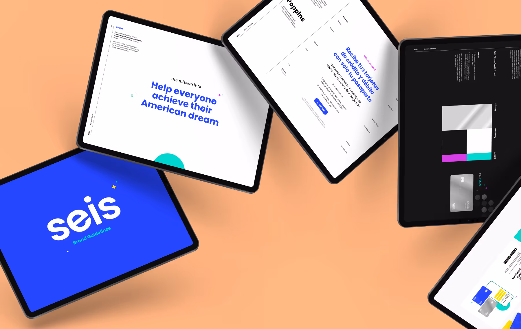
Seis is built around a clear mission: empowering individuals and families to pursue their version of the American dream. Their brand embodies financial access, trust, and community support—offering inclusive solutions designed to help their customers thrive. To bring that vision to life, we partnered with the Seis team in a hands-on brand workshop where we explored colors, type, and visual directions aligned to their three core pillars:
- Access — “Don’t make me think.” Everything should feel tighter, faster, easier. Seis creates access not just by offering financial tools, but by designing them in ways customers can’t get anywhere else.
- Guidance — “Seis has entered the group chat.” The brand centers on human connection—mirroring how customers rely on friends, family, and community for support. Seis builds trust through warm, conversational interactions and 1:1 guidance.
- Legit — Real-deal credibility. Seis is a destination, not a stepping-stone, and the brand reflects that through confident design, voice, and product positioning.
With those pillars in mind, we developed a fresh, modern color palette anchored in Seis’s signature blue and white, accented with mint, green, yellow, and pink for moments of contrast and personality. We paired it with Poppins, a rounded, friendly typeface that delivers warmth and inclusivity while remaining highly legible across devices and languages.
The Seis brand embodies financial access, trust, and community support
The visual identity brings Seis’s core pillars to life across color, type, and design, offering inclusive solutions designed to help their customers thrive.
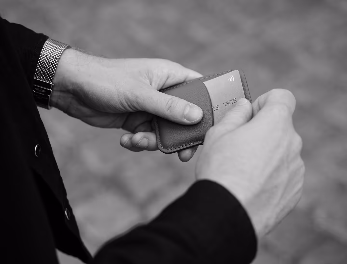
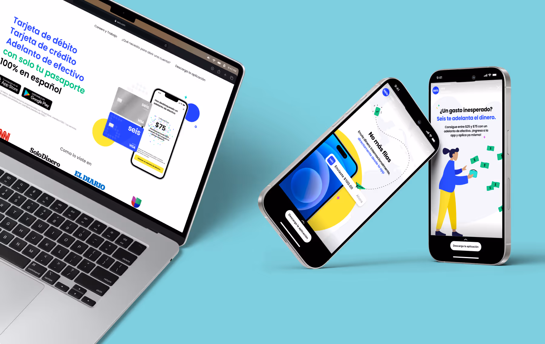
Once the brand direction was established, we created a complete visual system—defining primary and secondary logos, designing debit and credit card treatments, and translating the new identity into a cohesive marketing website that fully captures the heart of the Seis brand.
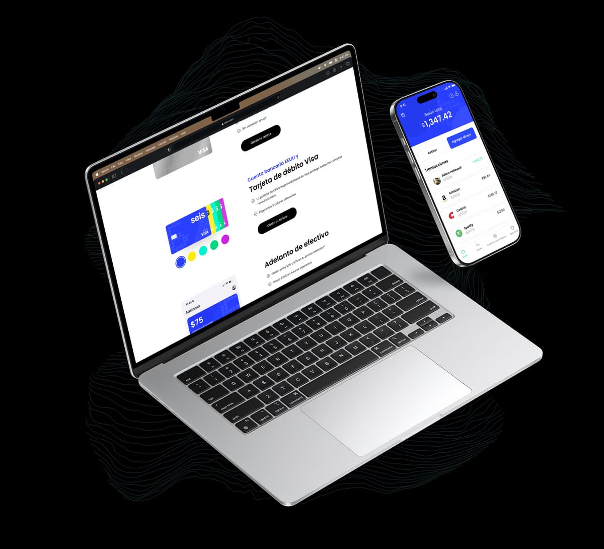
2) The app
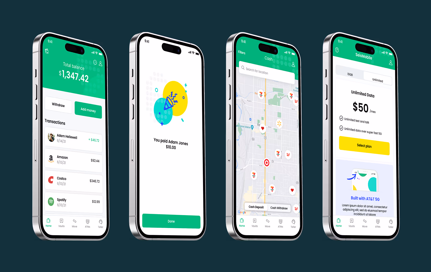
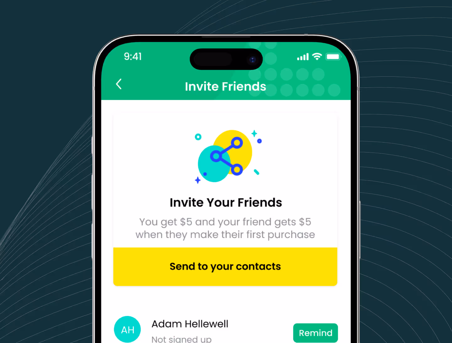
The Seis mobile app brings the brand’s mission into everyday life with a fast, intuitive banking experience on both iOS and Android. With 97,000+ reviews and a 4.9-star rating, it has become a trusted financial tool for the Seis community. The app allows customers to easily manage their money and cards, bringing essential banking features together in one seamless interface. Key capabilities include:
- Credit and debit management with clear visibility into balances and transactions
- Cash advance options for short-term flexibility
- A cash deposit map to quickly locate nearby deposit partners
- A credit-building program designed to help users strengthen their financial profile
- Instant, no-fee transfers to friends and family within the app
- Easy direct deposit setup for faster access to paychecks
- Vaults, simple savings buckets for specific goals
The result is a clear, approachable banking app designed to give customers more access, more guidance, and more control over their financial lives.
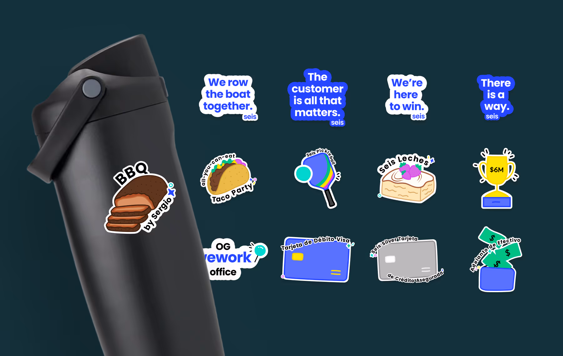
3) The physical collateral
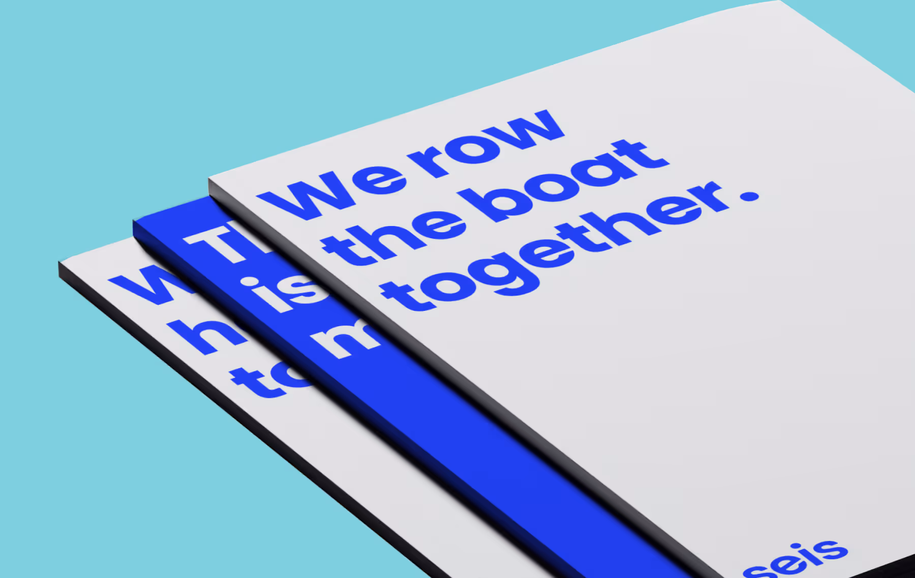
Physical merchandise isn’t our usual focus, but we’re always happy to jump in when the project calls for it. For Seis, we’ve designed everything from shirts, jerseys, socks, and hats to posters, booth displays, and specialty stickers—mostly for special events or internal teams.
These projects let us extend our creative approach, creating fun, memorable pieces that complement the broader brand experience we’ve built together. Even outside our typical scope, it’s another way we help Seis bring their brand to life.
Big ideas across every touchpoint, digital and physical.
Whether it’s branding, app development, or merch, our long-standing partnership with Seis shows how a collaborative approach brings brands to life at every stage of growth.