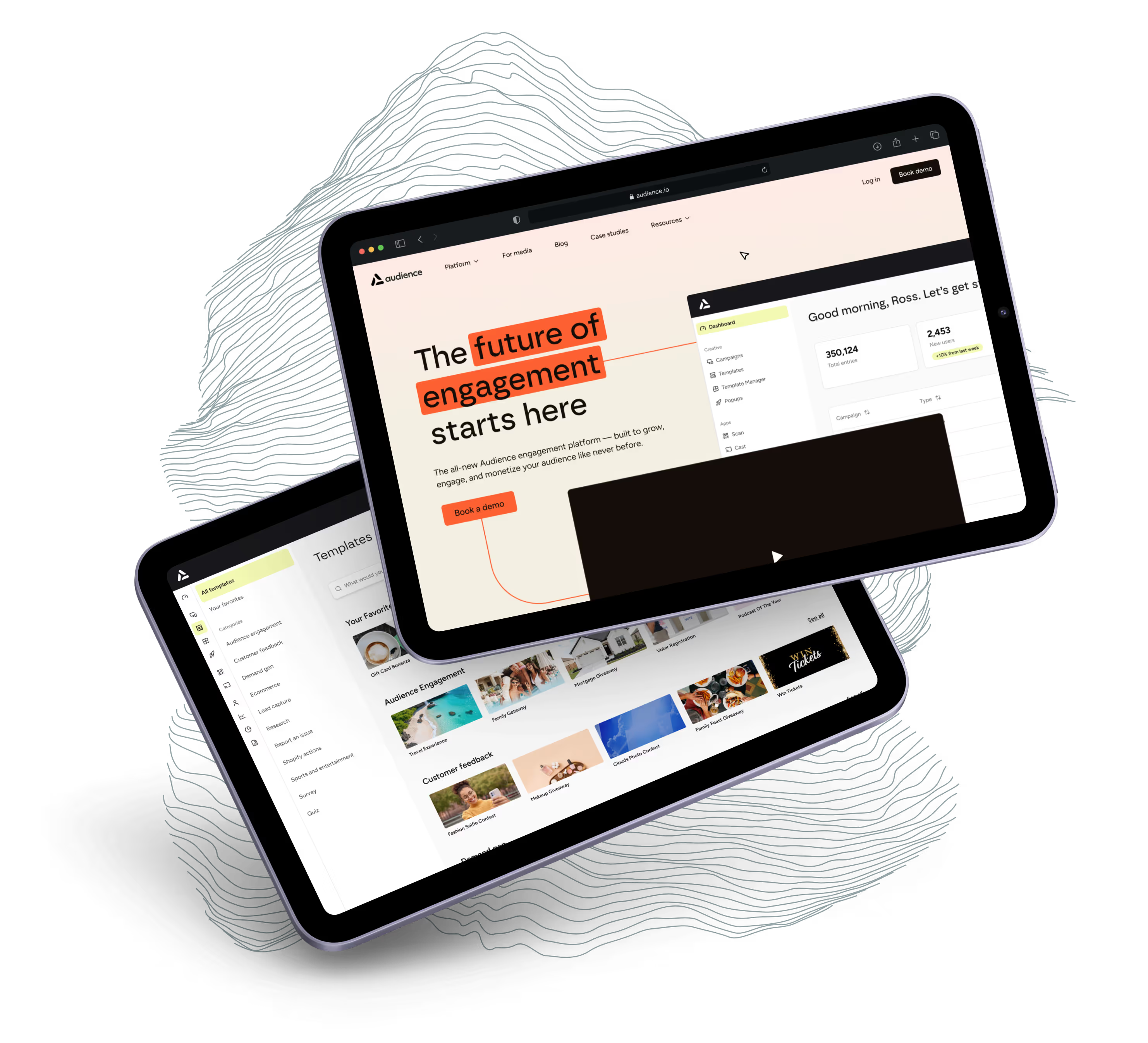


1) The goal
The team at Audience already had a suite of tools custom-built to help advertisers grow revenue. What they needed was an updated brand identity to represent their new, streamlined functionality, and a UI kit that was easy for their developers to implement. A few of their core goals:
- A Figma component library that can be efficiently matched in development
- A platform experience that bridges the gap between enterprise-level functionality and brand personality
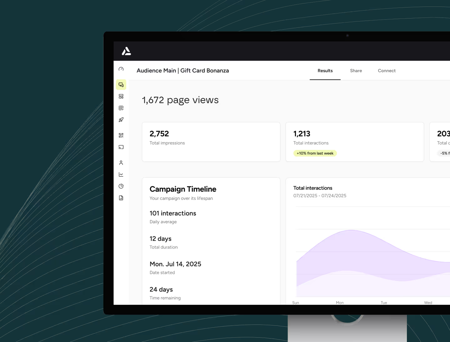
- Clear data analysis to share the story of their users’ campaigns
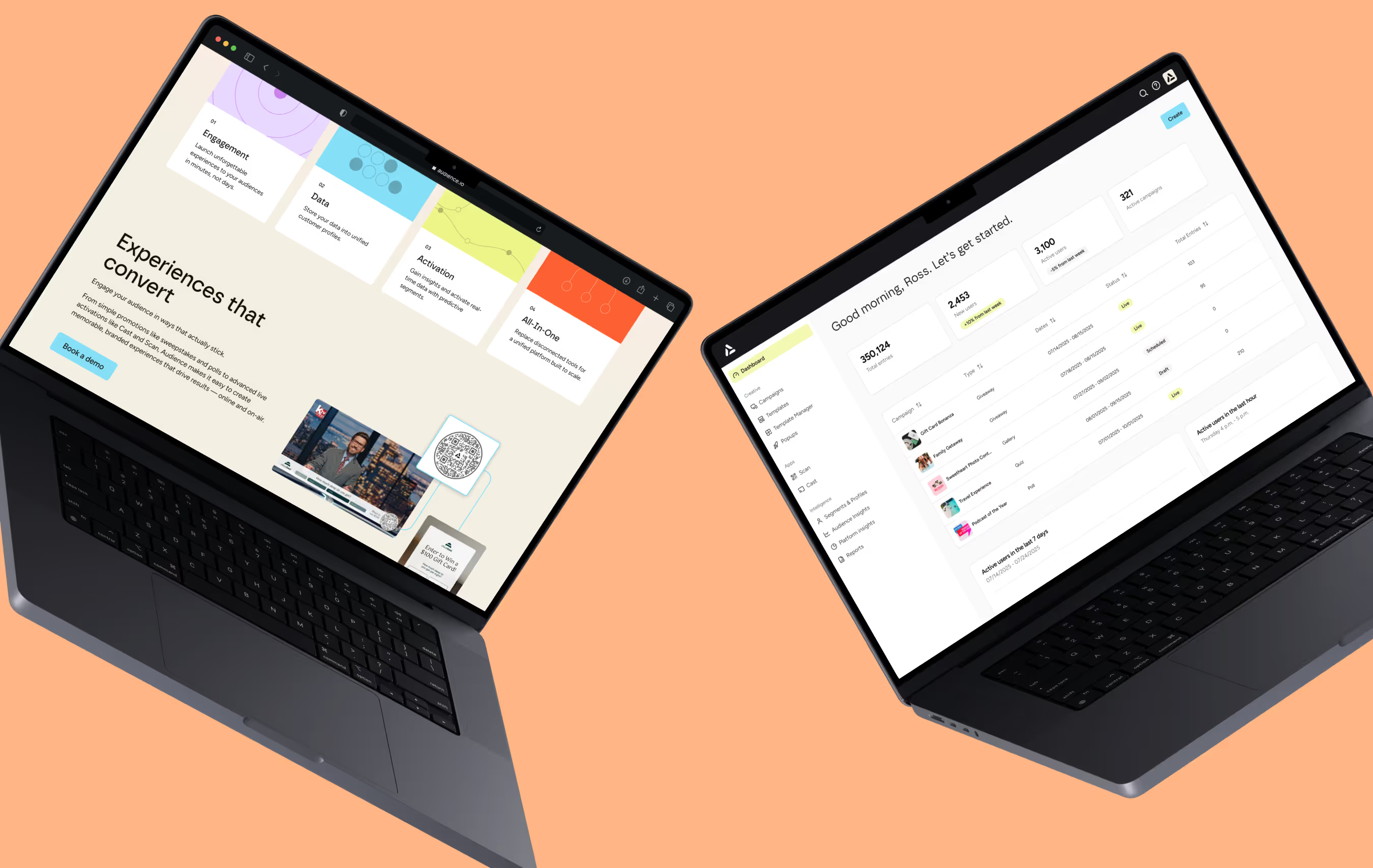
- Updated colors, fonts, and marketing templates that position Audience as a comprehensive advertising solution
Audience equips brands with powerful, easy-to-use, innovative experiences to drive loyalty and long-term value.
The new Audience platform combines AI-powered creation and personalization, a library of content and playbooks, and new ways to activate audiences to create immersive experiences at scale.
2) The UI kit
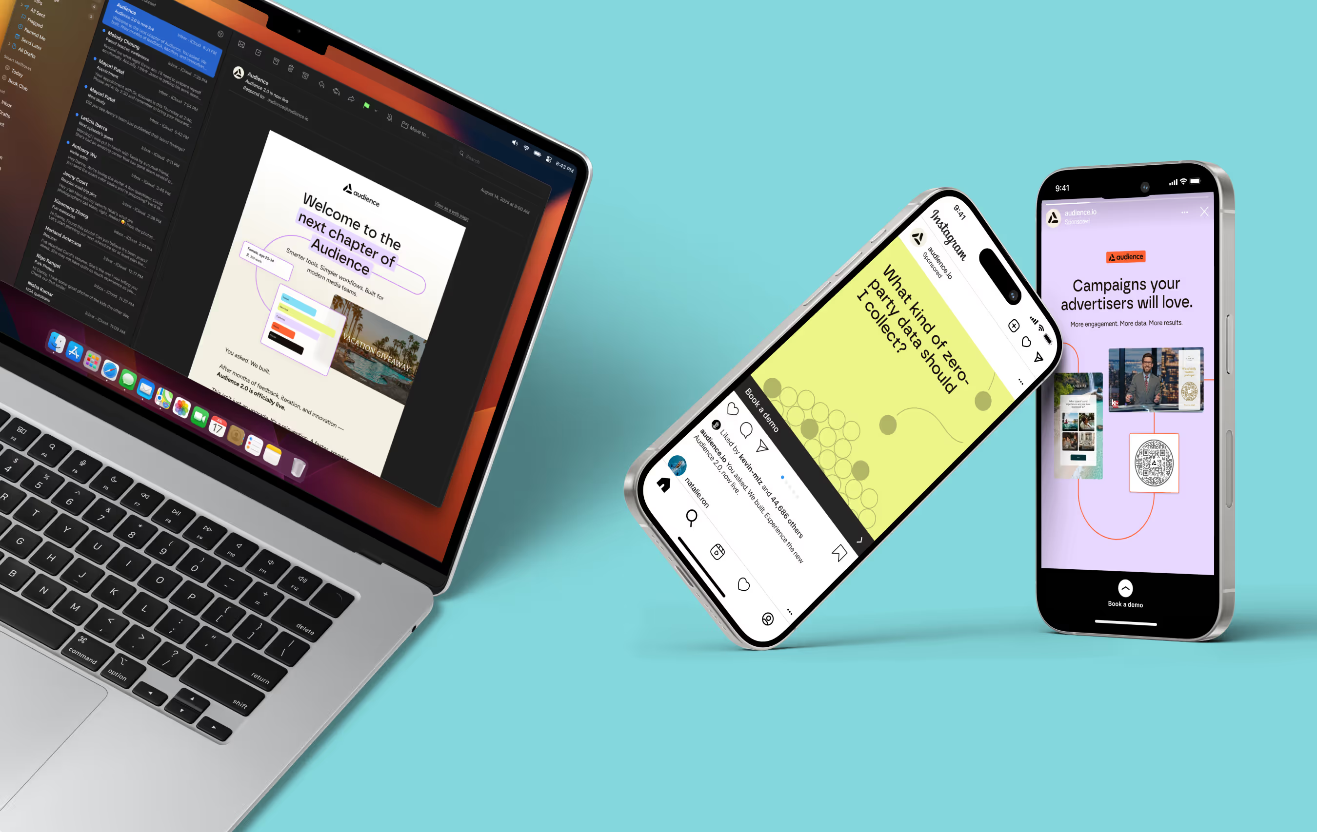
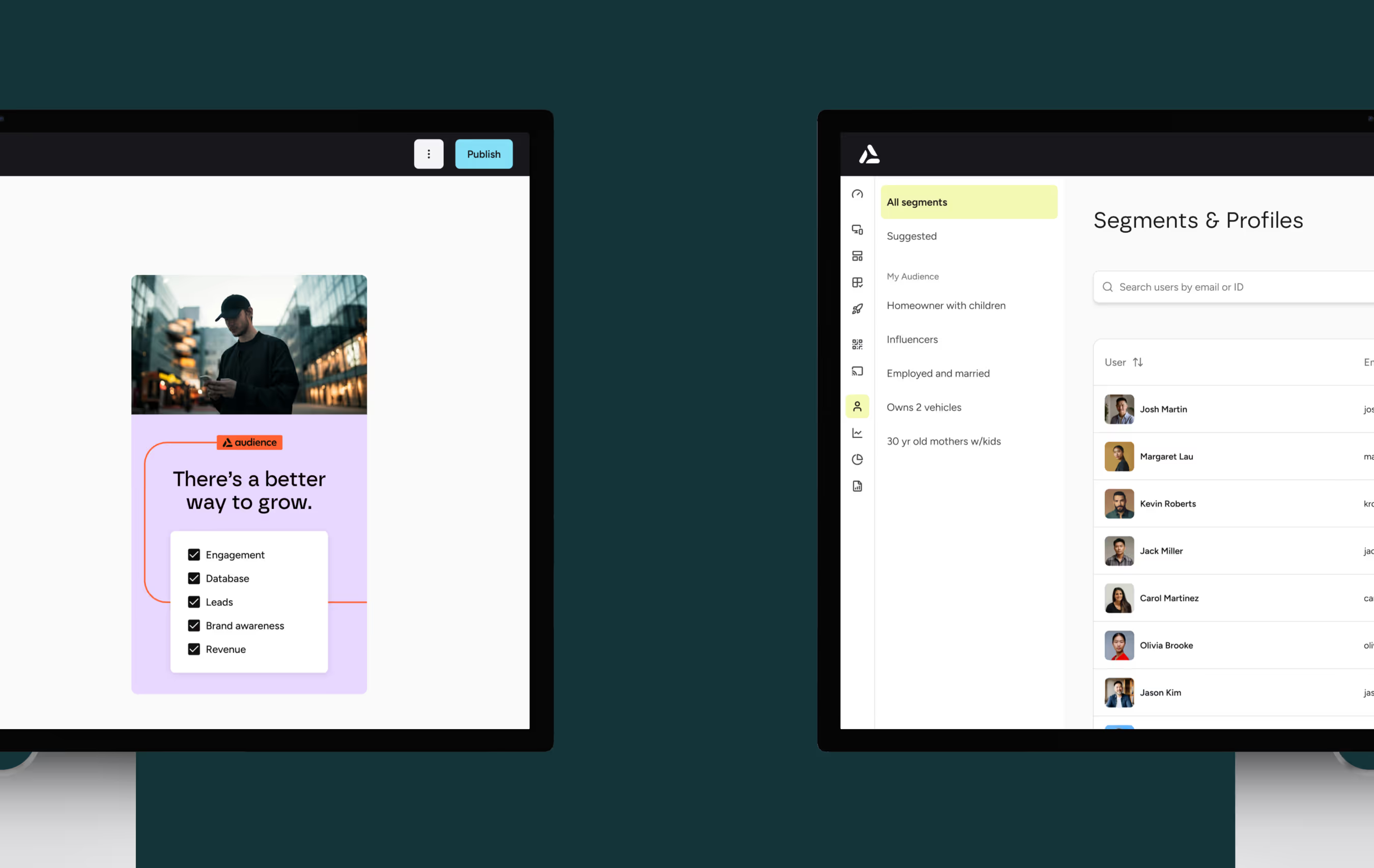
Audience’s new design system is built on shadcn/ui, an accessible, open-source, open-code component kit. This foundation allowed us to focus on detailed customizations at the component level, while ensuring the whole kit would scale seamlessly across all React frameworks.
The Audience UI kit includes updated versions of all existing platform components, plus a handful of new components and layout templates, enabling Audience’s development teams to iterate quickly on new pages. Additionally, data visualization can continue to evolve to meet the team’s needs, thanks to shadcn/ui’s chart library. Unused shadcn/ui components are archived in Figma for future use.
Development handoff included detailed notes on colors, typography, and component-level customizations.
3) The brand identity
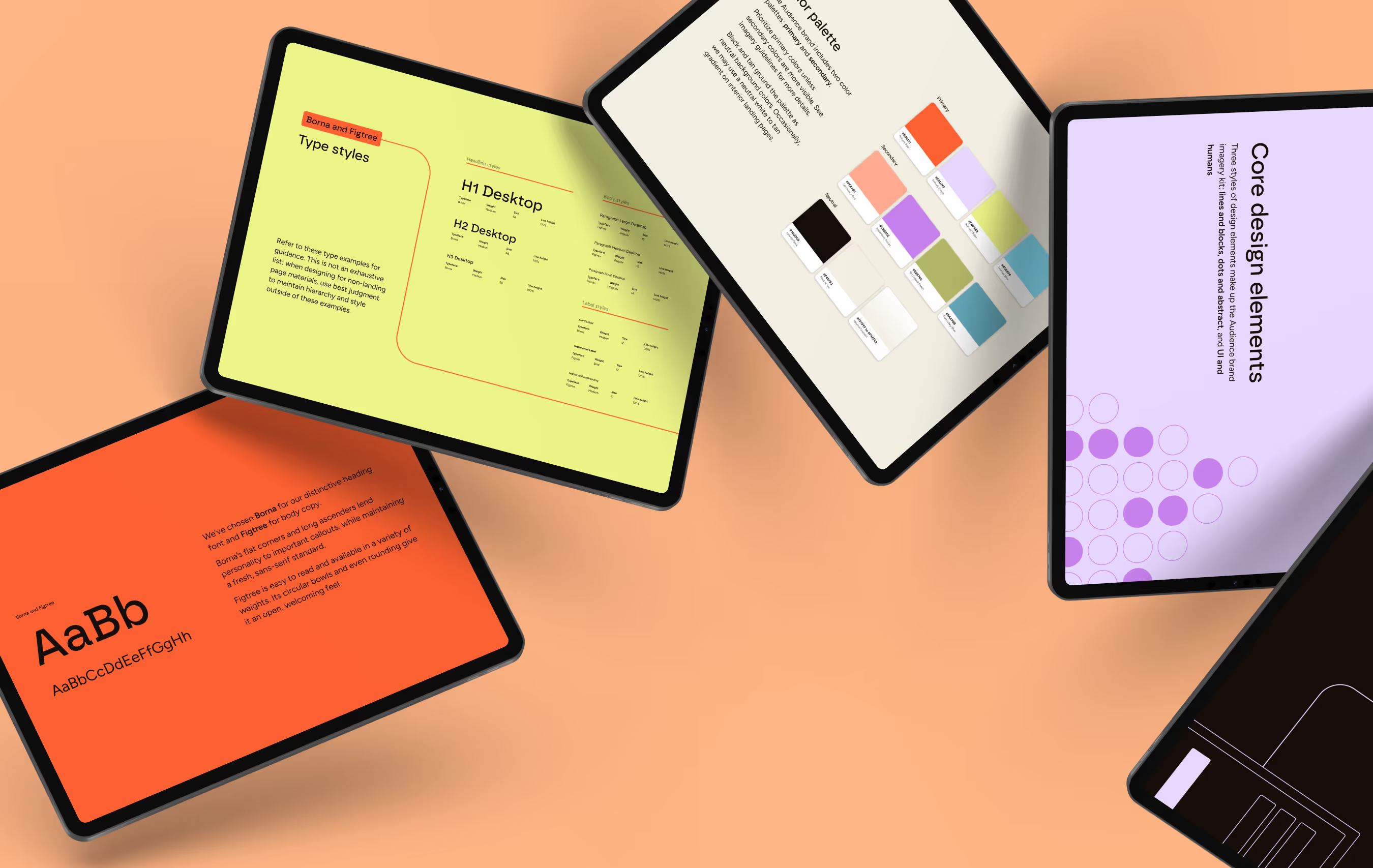
At the core of Audience’s new branding are its four brand pillars: frictionless, actionable, imaginative, and trusted, in that order of importance and weight. We collaborated with the Audience team to explore competitor and brand examples across a range of categories. We asked key questions to guide our work:
- What makes this effective?
- What captures attention?
- What prevents it from falling flat?
We then curated a set of colors, fonts, and graphic styles that aligned with the team’s vision, using them to shape the new identity of the Audience brand. The updated typography balances personality with functionality, while the refined color palette and strategic color pairings enhance visual impact through contrast and subtle tension. Graphic elements shift between three distinct styles, each representing a different facet of Audience’s diverse products and capabilities.
Audience is frictionless, actionable, imaginative, and trusted.
And its branding should represent that. We’re talking a streamlined tech stack, intelligence that frees up time, and creativity that converts. (All credit to the Audience team for that one. We love a good turn of phrase.)
4) Before the rebrand, the website
The 2025 brand work was not the first thing we built for Audience. In 2023 we rebuilt their marketing site, giving each of the five products in the platform its own page, from contesting through to segments and profiles.
That one ran to a published timeline. Designs finished on June 26 and Audience sent revisions back the next day. The build ran through the end of the month, and the site went live on July 5.
5) What the platform does for a station
Audience publishes results from campaigns run on the platform. 99.9 Virgin Radio, part of Bell Media, picked up 9,832 new email subscribers in a single week alongside 22,723 new users. Pattison Media ran a survey expecting 10,000 entries and took more than 34,000.