The short version
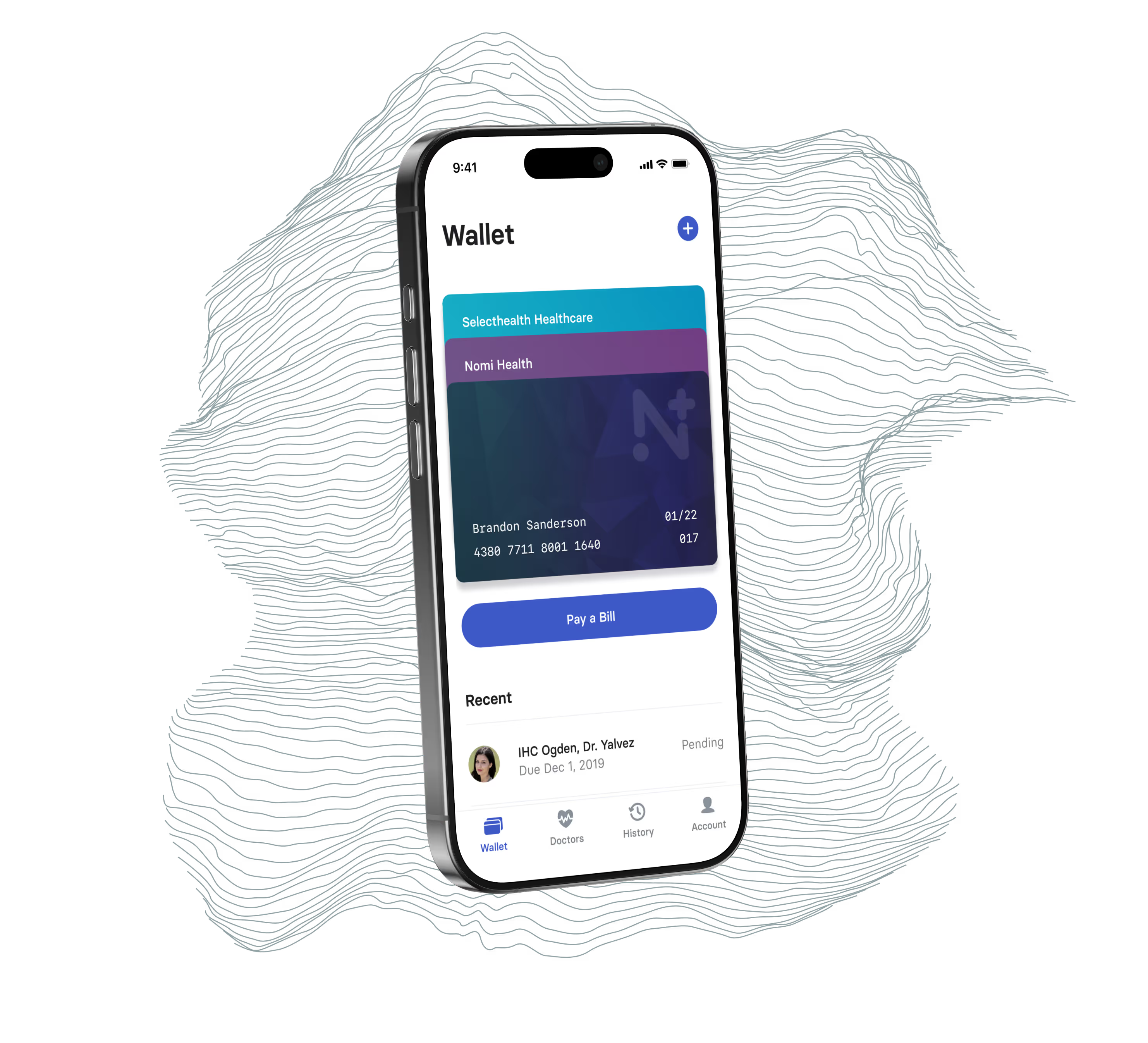
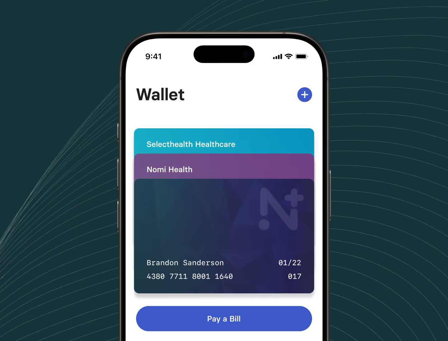
Nomi Health runs a direct-care model with no insurance middlemen, serving more than 30,000 Americans a day across more than 200 sites in 12 states. HQ worked with Nomi Health from UX through development to build one mobile-first patient app. Bill payment and provider search sit in the app alongside video intake and health history. Before the app, bills and providers lived in separate places while intake paperwork was still on paper. In the app, patients see what they owe and can pay a single bill or a whole date range at once. Patients can also track payment history without calling anyone. Video intake lets a patient record a short introduction before a visit, so the provider has context before the appointment starts. HQ also built a UI kit so the Nomi Health team can extend the app without remaking decisions already made. A three-person HQ team put 387 hours into the work between December 2019 and October 2020, and the design covers 168 production screens across 16 user flows.
The problem
Nomi Health operates on a direct-care model: no insurance middlemen, no surprise bills, transparent pricing. With $110M raised in their Series A and 200+ sites across 12 states, they were scaling fast. What they needed was a patient-facing app that matched the clarity of their care model.
The existing patient experience was fragmented. Bills came from one place, providers from another, and intake paperwork was still paper. For a company serving 30,000+ Americans per day, that friction added up.
What did HQ build?
HQ worked with Nomi on UX and development to bring the full patient experience into a single mobile-first app. The four core pieces: bill payment, provider search, video intake, and health history.

Bill payment was the highest-friction piece of the old experience. We rebuilt it so patients can see exactly what they owe, pay individual bills or a date range at once, and track payment history without calling anyone.

Video intake was a new capability we introduced to cut down on in-office paperwork. Patients record a short video introduction before their visit, which gives providers context before the appointment starts and reduces time spent on administrative questions.

Provider search pulls from Nomi’s network of direct-care sites and surfaces the closest locations with availability, so patients can find care without leaving the app.
How much went into the app?
A three-person HQ team logged 387 hours on the Nomi Health app between December 2019 and October 2020. More than half of those hours, about 215, fell in the first eight weeks, in December 2019 and January 2020.
The design covers 168 production screens across 16 user flows, wired into a clickable prototype with more than 1,850 interactions. Counting the explorations we tried and set aside, we designed 314 mobile screens to get there.
Design system
Because Nomi operates at scale and the app needed to grow with the company, we built a comprehensive UI kit alongside the product itself. Consistent components, tokens, and patterns meant the internal team could extend the app without recreating decisions that had already been made.