
Most clients never see a pull request. And honestly, they shouldn’t have to. GitHub is designed for engineers: diffs, file paths, merge conflicts. Asking a client to review a PR is like handing someone a blueprint and asking if they like the kitchen. The information is technically there, but it tells them nothing useful.
But here’s something that gets less attention: even for developers, reviewing visual changes is painful. You pull up the Vercel preview, click around, try to remember what the diff said was supposed to look different, and eventually give up and just approve. The code review is thorough; the visual review is a shrug.
So the feedback loop ends up broken on both ends: clients have no idea what changed, and developers don’t really verify it either. We built something to fix both.
The PR Review Overlay
The PR Review Overlay is a floating panel that attaches to any Vercel preview deployment. When a reviewer opens the preview link, the overlay launches automatically and walks them through every visible change in that pull request, one at a time, with context.
No GitHub account needed. No diff-reading. Just the live site with a guided tour of exactly what changed and why.
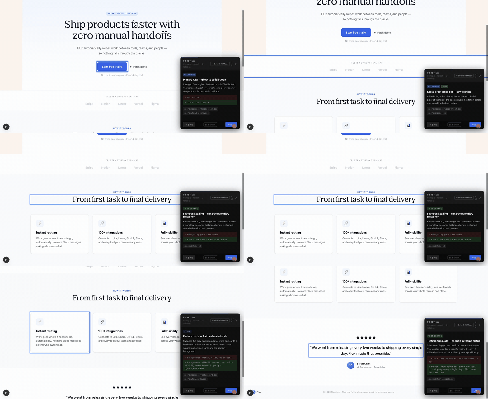
Each change card tells the reviewer three things: what type of change it is (text, UI, style), a plain-English title written by the developer, and the developer’s reasoning behind the decision. Below that, a before/after diff shows the exact content that changed, and the relevant file names are listed for anyone who wants to dig deeper.
For developers: a visual audit, not a scavenger hunt
The overlay isn’t just for clients. When another developer opens a PR preview, they normally have to hunt for what changed, clicking through pages, comparing mental notes from the diff, hoping they didn’t miss anything. With the overlay, that process is automated. Every visual change is surfaced, explained, and linked directly to the element on the live page.
This means developers can do an actual visual review in under two minutes instead of a cursory click-through. The before/after diff combined with the live element highlight makes it easy to catch regressions (a style that shifted, a layout that broke on a particular section) that a code review alone would never catch. And the file names on each card mean a reviewer can jump straight from “this looks off” to the exact line responsible.
It also changes how developers write PRs. When you know your visual changes are going to be walked through one at a time, you write better descriptions for them.
The page responds to the review
The part that makes this feel different from a static changelog is that the live page responds as you navigate through changes. When the overlay highlights a UI update, the element it’s talking about gets highlighted on the page behind it. When it’s walking through a text change, you’re reading the actual updated copy in context, not in a diff viewer.
This matters more than it sounds. Clients don’t think in components or file paths. They think in pages and feelings. Seeing “we changed the button label from ‘Get started’ to ‘Start free trial’” while the actual button is sitting right there behind the panel makes the decision real. They can evaluate it in context instead of trying to hold the before-state in their head.
Clients can redline copy directly
The overlay has a second mode: edit mode. When a client wants to suggest a copy change (a different headline, a tweaked CTA, a rephrased subhead), they don’t need to leave a comment somewhere and wait for a developer to make the change. They click the text, edit it inline, and the change is queued.
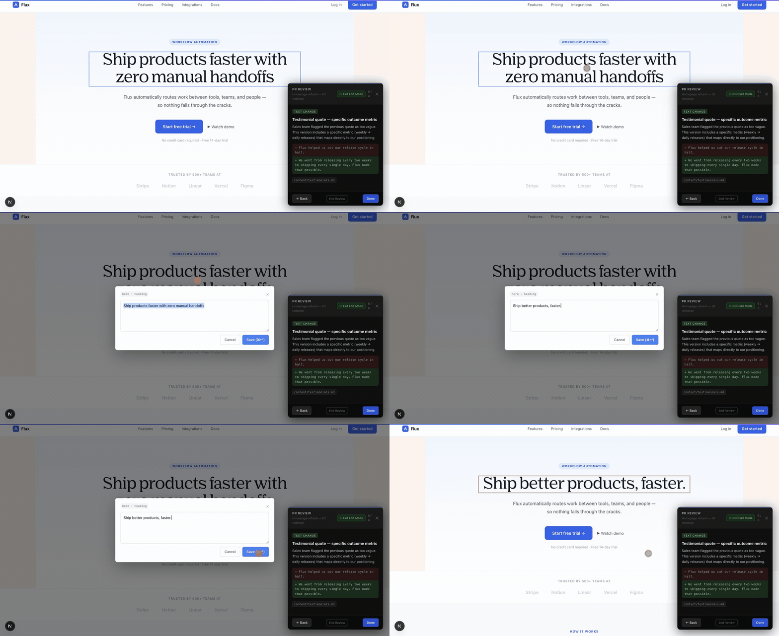
All of their edits accumulate in a pending changes dock. When they’re done, they hit Submit and the changes go straight to a pull request. No copy-pasting into Slack, no “can you just change this one word” messages.
It’s a workflow that makes sense for everyone in the loop. Developers reviewing the PR get a visual audit they can actually complete. Clients get a review experience that doesn’t require them to understand how version control works. And the developer who opened the PR gets feedback that’s specific and visual, instead of a thumbs up or a paragraph of Slack messages.
What it doesn’t do
Worth drawing the edges, because a tool that claims to have solved reviewing is overselling itself.
It only surfaces changes you can see. A refactor, a query that got faster, a fix to an edge case nobody hits on the happy path: none of that shows up here, and none of it should. This sits next to code review and works alongside it.
It also inherits whatever the developer wrote. The cards are only as good as the plain-English titles and the reasoning behind them, so a lazily described PR produces a lazy walkthrough. That’s turned out to be more feature than bug, since knowing your changes get read one at a time is a decent incentive, but the overlay can’t rescue a pull request nobody bothered to explain.
And in edit mode a client is changing words and images, not structure. They can’t take a page apart, which keeps the damage from a bad edit small, but it also means “this section should go above that one” is still a conversation rather than a click.
Try it yourself
The interactive demo at the top of this post shows exactly how the overlay works, from the initial walkthrough to making and submitting an edit. It’ll take about two minutes to go through the full flow.
If you’re interested in how this could work for your own project, get in touch.