An identity built on what the brand stands for
Before we pick a color or a font, we work out what the brand needs to say, usually as a short list of pillars ranked in order. We go through competitor and brand examples with your team, then design the logo, color system and typography to fit those pillars. Each piece is designed with the others in mind, so the logo still reads in every color and at every size.
Pillars first, visuals second
The look follows from what the brand needs to say.
A full logo system
A primary logo, a compact mark for small spaces, and every color version you'll need.
Color and type that work together
A palette and a pair of typefaces, with rules for which goes where.
A refresh that keeps the logo
Sometimes the logo still works and everything around it has gone stale. For Audience's 2.0 launch we kept their logo and rebuilt the rest over five months: four brand pillars, new colors and type, a brand guide, more than 20 marketing templates and a 26-component UI kit for the product.
Pillars first, again
Audience's four came first: frictionless, actionable, imaginative and trusted.
Carried into the product
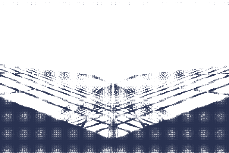
The same colors and type run through the UI kit, so the app matches the marketing.
Carried into everything you make
A brand only works if it shows up the same way everywhere. We apply it to your website, your product and your app, then to the emails, social posts and slide decks your team sends every week. When a project calls for physical things, we design those too, from shirts and hats to posters and stickers.
Digital first
Your site and product, built by the same team that designed the brand.
The everyday pieces
Email, social and slide templates your team can fill in themselves.
Print and merch
Shirts, hats, posters and stickers when you need them.
A brand hub your whole team can use
Brand guidelines usually end up as a PDF nobody can find. We build a small website for your brand instead: the colors with their codes, every logo file in every color ready to download, the typefaces, the imagery and the voice. We also publish the guidelines as a file AI tools like Claude can read, so a deck or landing page someone makes with AI comes out on-brand. It can sit behind a password if you'd rather keep it in-house.
Every file in one place
Logos, colors and type, downloadable without asking a designer.
Ready for AI tools
The same guidelines, written so Claude and other AI tools can follow them.
Featured project
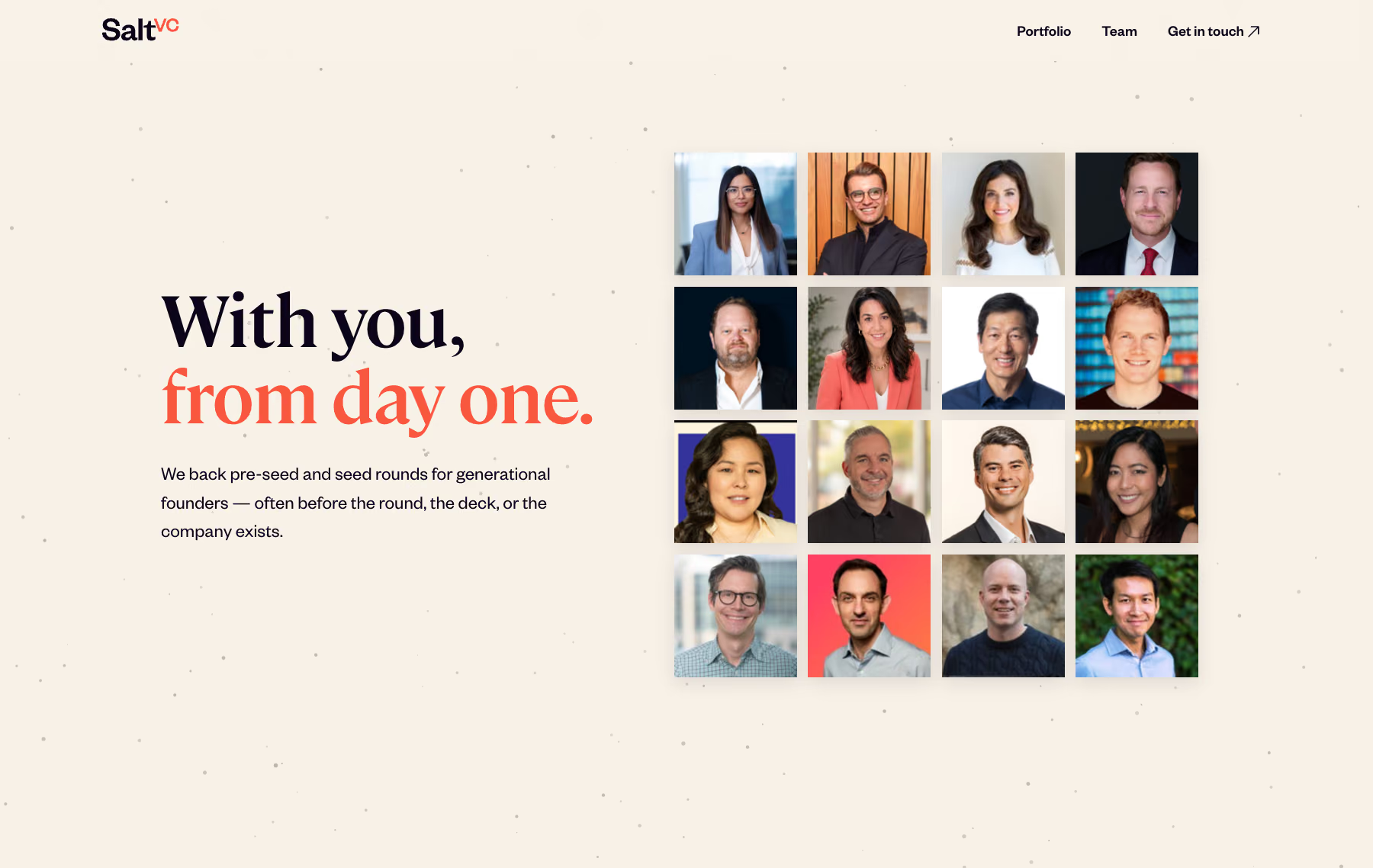
Salt VC: a brand, a website and a brand hub
Salt VC backs pre-seed and seed founders. We designed their brand, from a logo system with 14 color versions of every mark to the palette and type, then built salt.vc on it, with a CMS their team uses to update the portfolio and team pages. The brand hub at brand.salt.vc keeps every logo file and color code in one place.
Visit salt.vc
Frequently asked questions
Usually a logo, a color system, typography and guidelines that support real-world use. We size it to what you need.
Yes. Sometimes a client comes to us with a new logo and we build out the brand system around it. Other times the rebrand is done and we carry it through the website and blog.
A small website for your brand guidelines. Your team can copy a color code or download a logo without asking a designer, and AI tools can read the same guidelines.
Thinking about a new brand?
Tell us where your brand is today and where it needs to show up. Even if we're not the right fit, we'll point you somewhere that is.
Let's chat